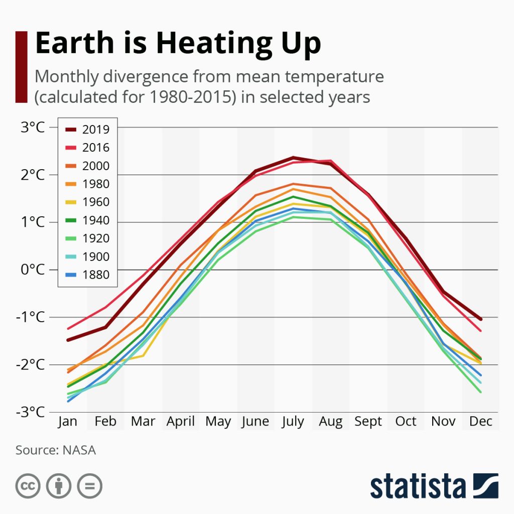
19 Jan. 2020. In case daily reports of giant fires, floods, extreme storms, droughts, and shrinking polar ice caps aren’t enough evidence of the climate crisis, a chart posted on Friday by our friends at Statista provides yet another sign our planet is dangerously warmer. Data for the chart and our bonus infographic this weekend were compiled by NASA at its Goddard Institute for Space Studies in Greenbelt, Maryland.
The chart plots average divergence from monthly temperatures of the earth’s surface over the course of a year beginning in 1880, then in 20-year increments up to 2000. After 2000, the chart reports on years 2016 and 2019. The data show 2019 was the second warmest year on record, after 2016. But the gap between 2000 and 2016 is striking.
Data are collected worldwide from weather stations worldwide as well as from ship, buoys and satellite measurements of the oceans. NASA crunches the numbers with the Modern-Era Retrospective analysis for Research and Applications, Version 2, or MEERA-2, model.
More from Science & Enterprise:
